Spacing
Spacing brings rhythm and fluidity to the interface. Our spacing tokens are based on Google Material scale with 16px as unit. Spacing can be used via padding and margin in web components.
Overview
| px |
Example
|
rem |
|---|---|---|
| 0 | 0 | |
| 2 | 0.125rem | |
| 4 | 0.25rem | |
| 8 | 0.5rem | |
| 12 | 0.75rem | |
| 16 | 1rem | |
| 20 | 1.25rem | |
| 24 | 1.5rem | |
| 32 | 2rem | |
| 48 | 3rem | |
| 64 | 4rem | |
| 80 | 5rem | |
| 96 | 6rem | |
| 112 | 7rem |
Usage
Every great design revolves around how the space is organized. Grid and spacing guide your designs through familiar patterns and put restrictions on decision-making. Following these same spacing patterns encourages interface homogenization and team cohesion.

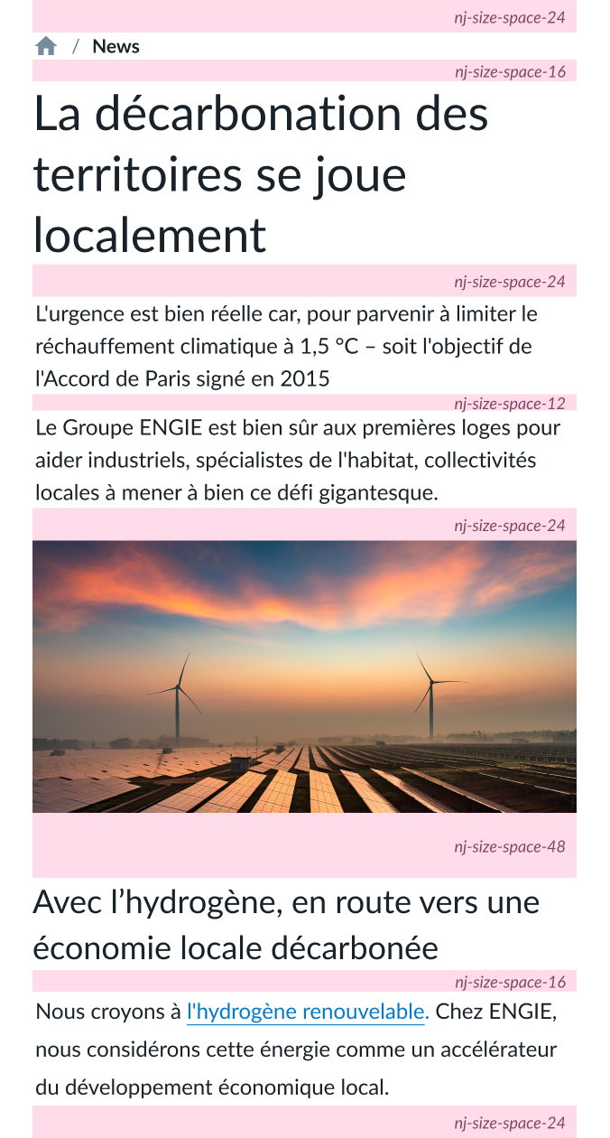
The use of spacing is flexible depending on the context (dashboard, landing, blog, etc.) : As an example, here between paragraphs 12px, between title and content 24px, between sections 48px.


Of course, we use spacing tokens also when we design our components.
Common mistakes
This identical UI pattern becomes visually pleasing and predictable when it is modified to match an 16px spacing rule. This clarifies the information on the page: user experience is streamlined.

Inconsistent spacings lead to unclear content.

Using spaces provided by Fluid spacing list helps clarifies the information on the page.

Using random spacing in your design creates confusion in the information hierarchy which impacts the user's understanding.

Following these simple rules allows you to achieve a more harmonious and clear design.
Code
Please refer to the design tokens page.