Meet Fluid 5
A more robust, more accessible and more usable version of Fluid. Built for you with your feedback.
Oh, and of course we integrated the new ENGIE brand.
We're excited! Hope you are too.
New branding, updated components and plenty of other sexy new features
Built for you to design for all
Detailed Figma documentation
We know designers are creatures who question themselves too often, so we made a documentation directly on Figma that allows you to know everything about each component to use it in the best way (eg: Do's and don’t...).
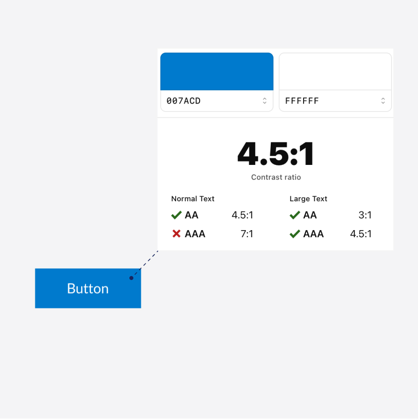
Accessible color palette
Interfaces should be accessible to as many people as possible. That's why we made sure that our color palette complies with the accessibility standards of the RGAA, so that each component is as well.
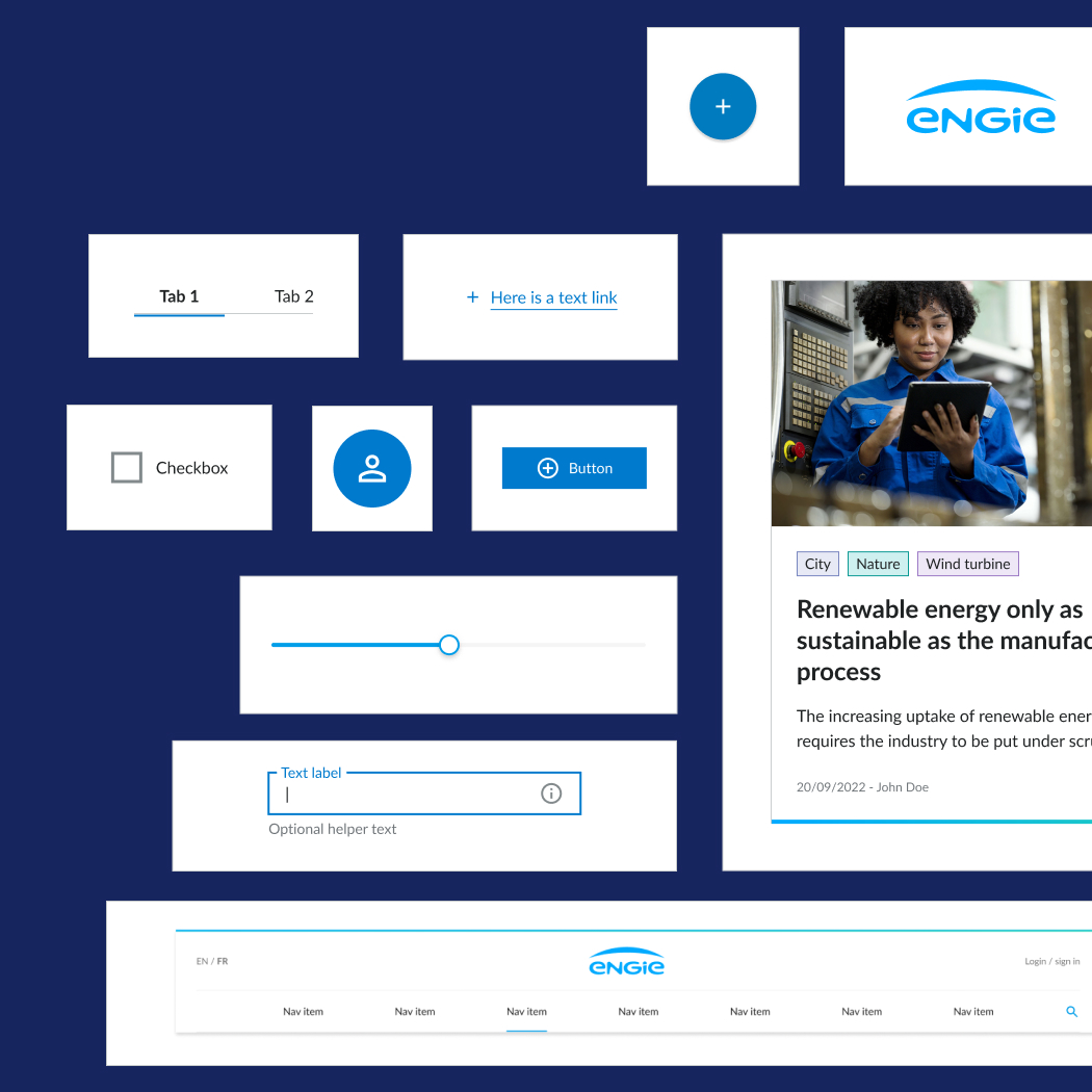
Sharp tool to design
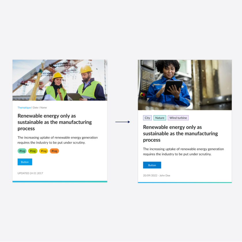
New UI: Simplicity. Made Clear.
Redesign of the components valuing flat design with squarer shapes, more horizontality, and a better harmonization of all the components.
Up-to-date with ENGIE rebranding
As you may know, ENGIE’s colors and guidelines have evolved: you obviously have the whole palette available on Fluid 5 (preview, hex codes, tokens, you have it all). You’ll notice the change of blue (and of course, it’s accessible now).
Get the most out of Figma
Variants & component properties
Have more control to tailor components to your needs by using the new component properties in the Figma Design panel. With these advanced component properties, your design experience is even more streamlined.
Interactive prototypes
You can now use interactive components to create prototypes with hover and click behaviours: this should help with communication between designers, developers and product owner. Nothing’s stopping you from testing your prototype with real users now!
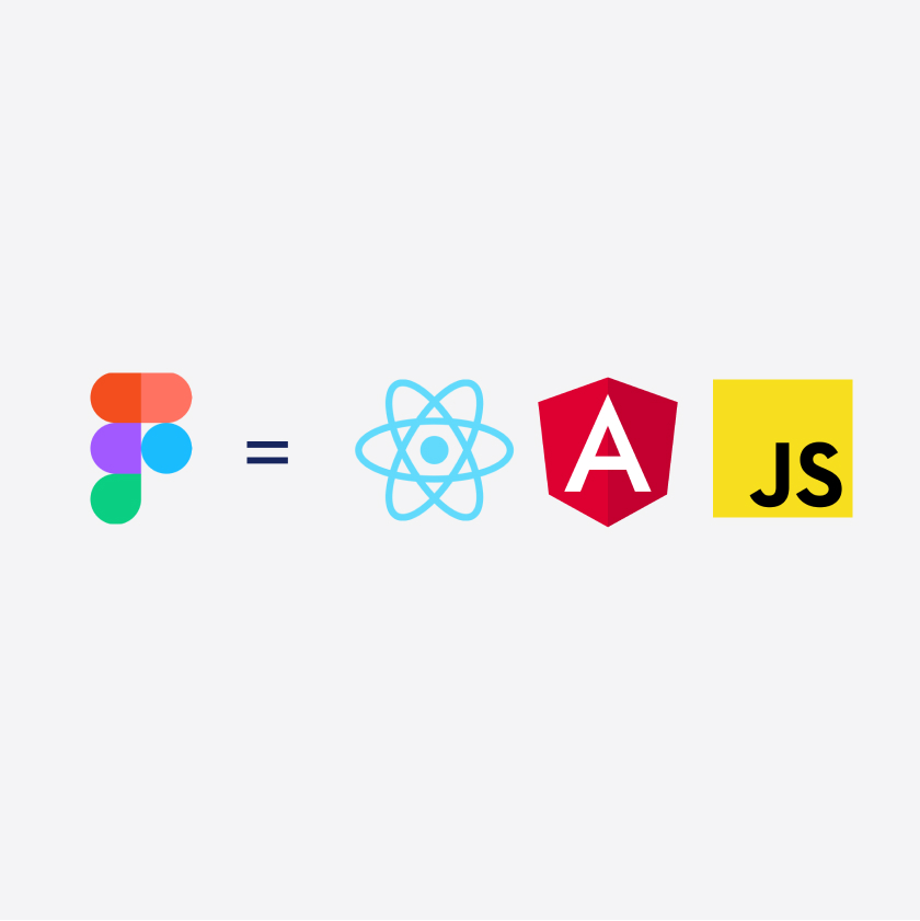
At last, developer-friendly
Your design. Your code. Always in sync.
Each update of the Figma library is synchronized with an equivalent update of all code libraries. This way, designers, developers and stakeholders can work together seamlessly to build better products.
New Angular components
Thanks to your numerous feedback, we did it! You can use new Fluid components in Angular (eg: Tag, auto-complete, select...).
We get it. A picture is worth a thousand words
Slide the line left and right to see what's changed!
Fluid 4 vs Fluid 5
Try our libraries of 35+ ready-to-use components
Whether you are a designer or a developer, we have curated resources to get started with your Fluid 5 migration. With Fluid 5 you'll be able to design responsive websites in no time.
See all the componentsRelease roadmap
Upcoming features
October 18th, 2022
Alignment with new ENGIE charter
- New color system: More robust color and grey palette, with accessible contrasts for components.
- Update of new user interface (UI) foundations (new border-radius, shadow, interactions)
- UI harmonization of all components to better fit the new ENGIE charter (eg: tag, switch, card)
Mid-November 2022
Fully accessible version of Fluid 5
- Additional accessible components (eg: focus, keyboard navigation, semantics, alternatives)
- Delivery of new components (eg: Side panel, accordion)
End of December 2022
Release of batch 3: Refined version
- Correction of eventual bugs.
- Delivery of missing components to be synchronised in design and development in each library (figma/vanilla/react/angular)
- Delivery of new components (eg: Dropdown menu, Notification, Button group, multi autocomplete/select)
Made for you by the Fluid team

Product manager
David De Vicente

Ux & Accessibility
Celine Bouillon


Product Designers
Cécile Onno
& Dorian Bonnaves


Front-end Developers
Massinissa Bouneffa
& Maxime Groff


Growth Managers
Maxime Breynat
& Jean Lepeudry
Getting in touch
Just so you know, 14 Fluid components and 23 Fluid tokens have been used on this page :)