Design Tokens
Design tokens are the single source of truth to name design decisions.
Token taxonomy
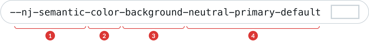
A design token’s name describes how it should be used, and each part communicates one piece of its usage.
-
1
Prefix: Namespace as a unique identifier and the tier the token belongs to (core, semantic or component)
-
2
Family: The type of visual design attribute or foundational style, such as color or elevation.
-
3
Property: The UI element the token is being applied to, such as a border, background, shadow, or other property.
-
4
Modifier(s): Additional details about the token’s purpose, such as its color role, emphasis, or interaction state. Not every token has a modifier.
Discover the complete guide to design tokens on the getting started figma file
Colors
Background colors
Neutral background s
var(--nj-semantic-color-background-neutral-primary-default)
Sets the background color to white, provides a clean and minimalist canvas for the interface. Classic foundation for content and components.
var(--nj-semantic-color-background-neutral-secondary-default)
Provides a subtle contrast with the primary background. Use to add a touch of visual interest without overpowering the content.
var(--nj-semantic-color-background-neutral-tertiary-default)
Provides a slightly stronger contrast with the primary background. Use to enhances the visual separation between different sections or elements.
var(--nj-semantic-color-background-neutral-solid-default)
Provides a distinct and noticeable contrast with the primary background. Adds a robust and substantial presence, use it to make the element stand out.
var(--nj-semantic-color-background-neutral-inverse-default)
Applies white as the background color, creating a striking visual effect when used on a dark-colored surface. Use to ensure readability and visual appeal in specific UI components or sections.
var(--nj-semantic-color-background-neutral-spotlight-default)
Creates a high contrast with the primary background. Use it for critical elements or components that require maximum emphasis and visual impact.
Brand background s
var(--nj-semantic-color-background-brand-secondary-default)
Establishes a subtle contrast with the primary background while using the brand color. Use it to add a touch of brand interest without overpowering the content.
var(--nj-semantic-color-background-brand-tertiary-default)
Creates a slightly stronger contrast with the primary background while using the brand color. Use it to enhances the visual separation between different sections or elements.
var(--nj-semantic-color-background-brand-solid-default)
Use to add a robust and substantial brand presence, making the elements stand out using the brand color.
var(--nj-semantic-color-background-brand-spotlight-default)
Creates a high contrast with the primary background while reminiscing of the brand identity. Use it for critical elements or components that require maximum emphasis and visual impact.
Status background s
Danger
var(--nj-semantic-color-background-status-danger-secondary-default)
var(--nj-semantic-color-background-status-danger-tertiary-default)
var(--nj-semantic-color-background-status-danger-solid-default)
Indicate a state of danger or criticality in your interface. Use for elements that require immediate attention due to errors, warnings, or potentially harmful actions. Serves as a powerful visual cue to alert users to potential issues and encourages careful consideration of their actions.
var(--nj-semantic-color-background-status-danger-spotlight-default)
Success
var(--nj-semantic-color-background-status-success-secondary-default)
var(--nj-semantic-color-background-status-success-tertiary-default)
var(--nj-semantic-color-background-status-success-solid-default)
Associated with successful or positive states in your interface. Apply it to elements or components that confirm successful actions or completion of tasks.
var(--nj-semantic-color-background-status-success-spotlight-default)
Warning
var(--nj-semantic-color-background-status-warning-secondary-default)
var(--nj-semantic-color-background-status-warning-tertiary-default)
var(--nj-semantic-color-background-status-warning-solid-default)
Conveys a warning or cautionary state in your interface. Use for elements that signify non-critical but important information, such as alerts, notices, or reminders. Helps users recognize situations that require their attention without implying immediate danger.
var(--nj-semantic-color-background-status-warning-spotlight-default)
Discovery
var(--nj-semantic-color-background-status-discovery-secondary-default)
var(--nj-semantic-color-background-status-discovery-tertiary-default)
var(--nj-semantic-color-background-status-discovery-solid-default)
Employed to highlight discovery or exploration-related content in your interface. Use to draw attention to new features, recommendations, or content suggestions. Invites users to explore and engage with new offerings, creating an exciting and engaging experience.
var(--nj-semantic-color-background-status-discovery-spotlight-default)
Information
var(--nj-semantic-color-background-status-information-solid-default)
Used for informational elements in your interface. Conveys non-critical information or provides additional details. Use for components or supplementary content that enhances the user's understanding of the interface without causing distraction.
var(--nj-semantic-color-background-status-information-secondary-default)
var(--nj-semantic-color-background-status-information-tertiary-default)
var(--nj-semantic-color-background-status-information-spotlight-default)
Planet
var(--nj-semantic-color-background-status-planet-solid-default)
var(--nj-semantic-color-background-status-planet-secondary-default)
var(--nj-semantic-color-background-status-planet-tertiary-default)
var(--nj-semantic-color-background-status-planet-spotlight-default)
Accent background s
Pink
var(--nj-semantic-color-background-accent-pink-secondary-default)
Subtle touch of pink with no meaning tied to the color.
var(--nj-semantic-color-background-accent-pink-tertiary-default)
Soft pink background with no meaning tied to the color, slightly stronger visual contrast than the secondary.
var(--nj-semantic-color-background-accent-pink-solid-default)
Suitable for pink backgrounds when there is no meaning tied to the color. Ensures the minimum contrast requirements (at least 4.55:1).
var(--nj-semantic-color-background-accent-pink-spotlight-default)
Reserved for highlighting and drawing maximum attention when there is no meaning tied to the color. Use sparingly to create important focal points in your interface
Red
var(--nj-semantic-color-background-accent-red-secondary-default)
Subtle touch of red with no meaning tied to the color.
var(--nj-semantic-color-background-accent-red-tertiary-default)
Soft red background with no meaning tied to the color, slightly stronger visual contrast than the secondary.
var(--nj-semantic-color-background-accent-red-solid-default)
Suitable for red backgrounds when there is no meaning tied to the color. Ensures the minimum contrast requirements (at least 4.55:1).
var(--nj-semantic-color-background-accent-red-spotlight-default)
Reserved for highlighting and drawing maximum attention when there is no meaning tied to the color. Use sparingly to create important focal points in your interface
Orange
var(--nj-semantic-color-background-accent-orange-secondary-default)
Subtle touch of orange with no meaning tied to the color.
var(--nj-semantic-color-background-accent-orange-tertiary-default)
Soft orange background with no meaning tied to the color, slightly stronger visual contrast than the secondary.
var(--nj-semantic-color-background-accent-orange-solid-default)
Suitable for orange backgrounds when there is no meaning tied to the color. Ensures the minimum contrast requirements (at least 4.55:1).
var(--nj-semantic-color-background-accent-orange-spotlight-default)
Reserved for highlighting and drawing maximum attention when there is no meaning tied to the color. Use sparingly to create important focal points in your interface
Yellow
var(--nj-semantic-color-background-accent-yellow-secondary-default)
Subtle touch of yellow with no meaning tied to the color.
var(--nj-semantic-color-background-accent-yellow-tertiary-default)
Soft yellow background with no meaning tied to the color, slightly stronger visual contrast than the secondary.
var(--nj-semantic-color-background-accent-yellow-solid-default)
Suitable for yellow backgrounds when there is no meaning tied to the color. No minimum contrast requirement met!
var(--nj-semantic-color-background-accent-yellow-spotlight-default)
Reserved for highlighting and drawing maximum attention when there is no meaning tied to the color. Use sparingly to create important focal points in your interface
Green
var(--nj-semantic-color-background-accent-green-secondary-default)
Subtle touch of green with no meaning tied to the color.
var(--nj-semantic-color-background-accent-green-tertiary-default)
Soft green background with no meaning tied to the color, slightly stronger visual contrast than the secondary.
var(--nj-semantic-color-background-accent-green-solid-default)
Suitable for green backgrounds when there is no meaning tied to the color. Ensures the minimum contrast requirements (at least 4.55:1).
var(--nj-semantic-color-background-accent-green-spotlight-default)
Reserved for highlighting and drawing maximum attention when there is no meaning tied to the color. Use sparingly to create important focal points in your interface
Grey
var(--nj-semantic-color-background-accent-grey-secondary-default)
Subtle touch of grey with no meaning tied to the color.
var(--nj-semantic-color-background-accent-grey-tertiary-default)
Soft grey background with no meaning tied to the color, slightly stronger visual contrast than the secondary.
var(--nj-semantic-color-background-accent-grey-solid-default)
Suitable for grey backgrounds when there is no meaning tied to the color. Ensures the minimum contrast requirements (at least 4.55:1).
var(--nj-semantic-color-background-accent-grey-spotlight-default)
Reserved for highlighting and drawing maximum attention when there is no meaning tied to the color. Use sparingly to create important focal points in your interface
Blue
var(--nj-semantic-color-background-accent-blue-secondary-default)
Subtle touch of blue with no meaning tied to the color.
var(--nj-semantic-color-background-accent-blue-tertiary-default)
Soft blue background with no meaning tied to the color, slightly stronger visual contrast than the secondary.
var(--nj-semantic-color-background-accent-blue-solid-default)
Suitable for blue backgrounds when there is no meaning tied to the color. Ensures the minimum contrast requirements (at least 4.55:1).
var(--nj-semantic-color-background-accent-blue-spotlight-default)
Reserved for highlighting and drawing maximum attention when there is no meaning tied to the color. Use sparingly to create important focal points in your interface
Ultramarine
var(--nj-semantic-color-background-accent-ultramarine-secondary-default)
Subtle touch of ultramarine with no meaning tied to the color.
var(--nj-semantic-color-background-accent-ultramarine-tertiary-default)
Soft ultramarine background with no meaning tied to the color, slightly stronger visual contrast than the secondary.
var(--nj-semantic-color-background-accent-ultramarine-solid-default)
Suitable for ultramarine backgrounds when there is no meaning tied to the color. Ensures the minimum contrast requirements (at least 4.55:1).
var(--nj-semantic-color-background-accent-ultramarine-spotlight-default)
Reserved for highlighting and drawing maximum attention when there is no meaning tied to the color. Use sparingly to create important focal points in your interface
Purple
var(--nj-semantic-color-background-accent-purple-secondary-default)
Subtle touch of purple with no meaning tied to the color.
var(--nj-semantic-color-background-accent-purple-tertiary-default)
Soft purple background with no meaning tied to the color, slightly stronger visual contrast than the secondary.
var(--nj-semantic-color-background-accent-purple-solid-default)
Suitable for purple backgrounds when there is no meaning tied to the color. Ensures the minimum contrast requirements (at least 4.55:1).
var(--nj-semantic-color-background-accent-purple-spotlight-default)
Reserved for highlighting and drawing maximum attention when there is no meaning tied to the color. Use sparingly to create important focal points in your interface
Teal
var(--nj-semantic-color-background-accent-teal-secondary-default)
Subtle touch of teal with no meaning tied to the color.
var(--nj-semantic-color-background-accent-teal-tertiary-default)
Soft teal background with no meaning tied to the color, slightly stronger visual contrast than the secondary.
var(--nj-semantic-color-background-accent-teal-solid-default)
Suitable for teal backgrounds when there is no meaning tied to the color. Ensures the minimum contrast requirements (at least 4.55:1).
var(--nj-semantic-color-background-accent-teal-spotlight-default)
Reserved for highlighting and drawing maximum attention when there is no meaning tied to the color. Use sparingly to create important focal points in your interface
Lime
var(--nj-semantic-color-background-accent-lime-secondary-default)
Subtle touch of lime with no meaning tied to the color.
var(--nj-semantic-color-background-accent-lime-tertiary-default)
Soft lime background with no meaning tied to the color, slightly stronger visual contrast than the secondary.
var(--nj-semantic-color-background-accent-lime-solid-default)
Suitable for lime backgrounds when there is no meaning tied to the color. Ensures the minimum contrast requirements (at least 4.55:1).
var(--nj-semantic-color-background-accent-lime-spotlight-default)
Reserved for highlighting and drawing maximum attention when there is no meaning tied to the color. Use sparingly to create important focal points in your interface
Additional background s
var(--nj-semantic-color-background-additional-engie-ray-default)
ENGIE's brand gradient. We strongly advise to refer to the brand guidelines for its usage.
var(--nj-semantic-color-background-additional-signature-default)
ENGIE's additional brand color. We strongly advise to refer to the brand guidelines for its usage.
var(--nj-semantic-color-background-additional-ai-default)
Artificial Intelligence brand gradient. We strongly advise to refer to the brand guidelines for its usage.
Border colors
Neutral border s
var(--nj-semantic-color-border-neutral-minimal-default)
Almost imperceptible, provides a gentle visual separation between elements without drawing much attention to itself. Used for separators.
var(--nj-semantic-color-border-neutral-subtle-default)
Offers a subtle visual distinction between elements, without overpowering the content. Used for separators and cards.
var(--nj-semantic-color-border-neutral-moderate-default)
Provides a clear separation between elements, ensuring they stand out without becoming too overwhelming. Use for tags and inputs.
var(--nj-semantic-color-border-neutral-strong-default)
Bold border, creates a striking visual division between elements. Use for notifications, inline messages and focus ring.
var(--nj-semantic-color-border-neutral-heavy-default)
Highest level of visual differentiation. Has a strong contrast with the background, making it visually prominent and attention-grabbing. Use for important alerts.
var(--nj-semantic-color-border-neutral-inverse-default)
Allows the application of a border when used on a contrasted background. Use for inverse buttons or inverse cards.
Brand border s
var(--nj-semantic-color-border-brand-subtle-default)
Provides a gentle visual separation between elements, with a touch of Engie's brand identity.Suitable for elements where a subtle brand presence is desired.
var(--nj-semantic-color-border-brand-moderate-default)
Provides a clear separation between elements with the brand identity. Use for tags and inputs.
var(--nj-semantic-color-border-brand-strong-default)
Bold brand border, creates a striking visual division between elements. Use for borders or visual indicators of elements that reinforce Engie's brand, such as notifications, inline messages and focus ring.
Status border s
Danger
var(--nj-semantic-color-border-status-danger-subtle-default)
Subtle way to communicate critical information without overpowering the content. Use for separators and cards.
var(--nj-semantic-color-border-status-danger-moderate-default)
Communicates critical information in your interface. Provides a clear separation between elements, ensuring they stand out without becoming too overwhelming. Use for tags and inputs.
var(--nj-semantic-color-border-status-danger-strong-default)
Intended to indicate a state of danger or criticality in your interface. Use for elements that require immediate attention due to errors, warnings, or potentially harmful actions. Serves as a powerful visual cue to alert users to potential issues and encourages careful consideration of their actions.
Warning
var(--nj-semantic-color-border-status-warning-subtle-default)
Subtle way to communicate warning information without overpowering the content. Use for separators and cards.
var(--nj-semantic-color-border-status-warning-moderate-default)
Communicates warning information in your interface. Provides a clear separation between elements, ensuring they stand out without becoming too overwhelming.
var(--nj-semantic-color-border-status-warning-strong-default)
Conveys a warning or cautionary state in your interface. Use for elements that signify non-critical but important information, such as alerts, notices, or reminders. Helps users recognize situations that require their attention without implying immediate danger.
Success
var(--nj-semantic-color-border-status-success-subtle-default)
Subtle way to communicate success information or positive states without overpowering the content. Use for separators and cards.
var(--nj-semantic-color-border-status-success-moderate-default)
Communicates successful or positive states in your interface. Provides a clear separation between elements, ensuring they stand out without becoming too overwhelming.
var(--nj-semantic-color-border-status-success-strong-default)
Associated with successful or positive states in your interface. Apply it to elements or components that confirm successful actions or completion of tasks.
Discovery
var(--nj-semantic-color-border-status-discovery-subtle-default)
Subtle way to highlight discovery or exploration-related content in your interface without overpowering the content. Use for separators and cards.
var(--nj-semantic-color-border-status-discovery-moderate-default)
Highlights discovery or communicates exploration-related content in your interface. Provides a clear separation between elements, ensuring they stand out without becoming too overwhelming.
var(--nj-semantic-color-border-status-discovery-strong-default)
Employed to highlight discovery or exploration-related content in your interface. Use to draw attention to new features, recommendations, or content suggestions. Invites users to explore and engage with new offerings, creating an exciting and engaging experience.
Information
var(--nj-semantic-color-border-status-information-subtle-default)
Subtle way to highlight informational elements in your interface without overpowering the content. Use for separators and cards.
var(--nj-semantic-color-border-status-information-moderate-default)
Highlights informational elements in your interface. Provides a clear separation between elements, ensuring they stand out without becoming too overwhelming.
var(--nj-semantic-color-border-status-information-strong-default)
Used for informational elements in your interface. Conveys non-critical information or provides additional details. Use for components or supplementary content that enhances the user's understanding of the interface without causing distraction.
Planet
var(--nj-semantic-color-border-status-planet-subtle-default)
var(--nj-semantic-color-border-status-planet-moderate-default)
var(--nj-semantic-color-border-status-planet-strong-default)
Accent border s
Pink
var(--nj-semantic-color-border-accent-pink-subtle-default)
var(--nj-semantic-color-border-accent-pink-moderate-default)
Suitable for pink borders when there is no meaning tied to the color.
var(--nj-semantic-color-border-accent-pink-strong-default)
Red
var(--nj-semantic-color-border-accent-red-subtle-default)
var(--nj-semantic-color-border-accent-red-moderate-default)
Suitable for red borders when there is no meaning tied to the color.
var(--nj-semantic-color-border-accent-red-strong-default)
Orange
var(--nj-semantic-color-border-accent-orange-subtle-default)
var(--nj-semantic-color-border-accent-orange-moderate-default)
Suitable for orange borders when there is no meaning tied to the color.
var(--nj-semantic-color-border-accent-orange-strong-default)
Yellow
var(--nj-semantic-color-border-accent-yellow-subtle-default)
var(--nj-semantic-color-border-accent-yellow-moderate-default)
Suitable for yellow borders when there is no meaning tied to the color.
var(--nj-semantic-color-border-accent-yellow-strong-default)
Green
var(--nj-semantic-color-border-accent-green-subtle-default)
var(--nj-semantic-color-border-accent-green-moderate-default)
Suitable for green borders when there is no meaning tied to the color.
var(--nj-semantic-color-border-accent-green-strong-default)
Grey
var(--nj-semantic-color-border-accent-grey-subtle-default)
var(--nj-semantic-color-border-accent-grey-moderate-default)
Suitable for grey borders when there is no meaning tied to the color.
var(--nj-semantic-color-border-accent-grey-strong-default)
Blue
var(--nj-semantic-color-border-accent-blue-subtle-default)
var(--nj-semantic-color-border-accent-blue-moderate-default)
Suitable for blue borders when there is no meaning tied to the color.
var(--nj-semantic-color-border-accent-blue-strong-default)
Ultramarine
var(--nj-semantic-color-border-accent-ultramarine-subtle-default)
var(--nj-semantic-color-border-accent-ultramarine-moderate-default)
Suitable for ultramarine borders when there is no meaning tied to the color.
var(--nj-semantic-color-border-accent-ultramarine-strong-default)
Purple
var(--nj-semantic-color-border-accent-purple-subtle-default)
var(--nj-semantic-color-border-accent-purple-moderate-default)
Suitable for purple borders when there is no meaning tied to the color.
var(--nj-semantic-color-border-accent-purple-strong-default)
Teal
var(--nj-semantic-color-border-accent-teal-subtle-default)
var(--nj-semantic-color-border-accent-teal-moderate-default)
Suitable for teal borders when there is no meaning tied to the color.
var(--nj-semantic-color-border-accent-teal-strong-default)
Lime
var(--nj-semantic-color-border-accent-lime-subtle-default)
var(--nj-semantic-color-border-accent-lime-moderate-default)
Suitable for lime borders when there is no meaning tied to the color.
var(--nj-semantic-color-border-accent-lime-strong-default)
Additional border s
var(--nj-semantic-color-border-additional-ai-default)
Artificial Intelligence brand gradient. We strongly advise to refer to the brand guidelines for its usage.
Text colors
Neutral text s
var(--nj-semantic-color-text-neutral-primary-default)
Reserved for the most critical and visually prominent content in the interface. Should be employed for elements like page titles and section headings, where it commands attention and establishes hierarchy.
var(--nj-semantic-color-text-neutral-primary-not-invertible-default)
var(--nj-semantic-color-text-neutral-secondary-default)
Harmonious and legible contrast for various content types. Well-suited for subtitles, subheadings, and regular content, ensures a balanced and readable appearance throughout the interface.
var(--nj-semantic-color-text-neutral-tertiary-default)
Slightly lighter, suitable for secondary subtitles or contextual information. Ideal for additional information.
var(--nj-semantic-color-text-neutral-contrast-default)
Emphasizes elements with higher contrast to create visual hierarchy and draw attention.
var(--nj-semantic-color-text-neutral-inverse-default)
Used for light text on a dark background for readability and visual appeal in specific UI components.
var(--nj-semantic-color-text-neutral-inverse-not-invertible-default)
Brand text s
var(--nj-semantic-color-text-brand-primary-default)
Powerful tool to reinforce the brand's presence and create visual emphasis. Use strategically for text elements that are central to the brand identity or require heightened attention, such as brand names, key headlines, or links.
var(--nj-semantic-color-text-brand-contrast-default)
Used on secondary backgrounds to keep the the contrast ratio for accessibility reasons.
Status text s
Danger
var(--nj-semantic-color-text-status-danger-primary-default)
var(--nj-semantic-color-text-status-danger-contrast-default)
Warning
var(--nj-semantic-color-text-status-warning-primary-default)
var(--nj-semantic-color-text-status-warning-contrast-default)
Success
var(--nj-semantic-color-text-status-success-primary-default)
var(--nj-semantic-color-text-status-success-contrast-default)
Information
var(--nj-semantic-color-text-status-information-primary-default)
var(--nj-semantic-color-text-status-information-contrast-default)
Discovery
var(--nj-semantic-color-text-status-discovery-primary-default)
var(--nj-semantic-color-text-status-discovery-contrast-default)
Planet
var(--nj-semantic-color-text-status-planet-primary-default)
var(--nj-semantic-color-text-status-planet-contrast-default)
Accent text s
Pink
var(--nj-semantic-color-text-accent-pink-primary-default)
var(--nj-semantic-color-text-accent-pink-contrast-default)
Red
var(--nj-semantic-color-text-accent-red-primary-default)
var(--nj-semantic-color-text-accent-red-contrast-default)
Orange
var(--nj-semantic-color-text-accent-orange-primary-default)
var(--nj-semantic-color-text-accent-orange-contrast-default)
Yellow
var(--nj-semantic-color-text-accent-yellow-primary-default)
var(--nj-semantic-color-text-accent-yellow-contrast-default)
Green
var(--nj-semantic-color-text-accent-green-primary-default)
var(--nj-semantic-color-text-accent-green-contrast-default)
Grey
var(--nj-semantic-color-text-accent-grey-primary-default)
var(--nj-semantic-color-text-accent-grey-contrast-default)
Blue
var(--nj-semantic-color-text-accent-blue-primary-default)
var(--nj-semantic-color-text-accent-blue-contrast-default)
Ultramarine
var(--nj-semantic-color-text-accent-ultramarine-primary-default)
var(--nj-semantic-color-text-accent-ultramarine-contrast-default)
Purple
var(--nj-semantic-color-text-accent-purple-primary-default)
var(--nj-semantic-color-text-accent-purple-contrast-default)
Teal
var(--nj-semantic-color-text-accent-teal-primary-default)
var(--nj-semantic-color-text-accent-teal-contrast-default)
Lime
var(--nj-semantic-color-text-accent-lime-primary-default)
var(--nj-semantic-color-text-accent-lime-contrast-default)
Additional text s
var(--nj-semantic-color-text-additional-signature-default)
Icon colors
Neutral icon s
var(--nj-semantic-color-icon-neutral-primary-default)
Use for visible and prominent icons, ensures they are easily recognizable and stand out. Typically used for essential actions or navigation elements that require immediate user attention.
var(--nj-semantic-color-icon-neutral-secondary-default)
Use for less visible icons, offering a subtle presence that complements the primary content. Used for secondary actions or to support elements within the interface.
var(--nj-semantic-color-icon-neutral-tertiary-default)
Use for icons with even lower visibility, providing a more understated appearance. These icons are used for tertiary actions or optional elements, contributing to a more streamlined and unobtrusive user experience.
var(--nj-semantic-color-icon-neutral-contrast-default)
These icons utilizes higher contrast or distinct visual treatments to create emphasis and draw attention. It is employed for icons that require enhanced visibility or a stronger visual impact.
var(--nj-semantic-color-icon-neutral-inverse-default)
Use for icons on dark backgrounds. Ensures readability and visual appeal, particularly in scenarios where icons are placed on contrasting surfaces.
Brand icon s
var(--nj-semantic-color-icon-brand-primary-default)
var(--nj-semantic-color-icon-brand-contrast-default)
Status icon s
Danger
var(--nj-semantic-color-icon-status-danger-primary-default)
var(--nj-semantic-color-icon-status-danger-contrast-default)
Success
var(--nj-semantic-color-icon-status-success-primary-default)
var(--nj-semantic-color-icon-status-success-contrast-default)
Warning
var(--nj-semantic-color-icon-status-warning-primary-default)
var(--nj-semantic-color-icon-status-warning-contrast-default)
Discovery
var(--nj-semantic-color-icon-status-discovery-primary-default)
var(--nj-semantic-color-icon-status-discovery-contrast-default)
Information
var(--nj-semantic-color-icon-status-information-primary-default)
var(--nj-semantic-color-icon-status-information-contrast-default)
Planet
var(--nj-semantic-color-icon-status-planet-primary-default)
var(--nj-semantic-color-icon-status-planet-contrast-default)
Accent icon s
Pink
var(--nj-semantic-color-icon-accent-pink-primary-default)
var(--nj-semantic-color-icon-accent-pink-contrast-default)
Red
var(--nj-semantic-color-icon-accent-red-primary-default)
var(--nj-semantic-color-icon-accent-red-contrast-default)
Orange
var(--nj-semantic-color-icon-accent-orange-primary-default)
var(--nj-semantic-color-icon-accent-orange-contrast-default)
Yellow
var(--nj-semantic-color-icon-accent-yellow-primary-default)
var(--nj-semantic-color-icon-accent-yellow-contrast-default)
Green
var(--nj-semantic-color-icon-accent-green-primary-default)
var(--nj-semantic-color-icon-accent-green-contrast-default)
Grey
var(--nj-semantic-color-icon-accent-grey-primary-default)
var(--nj-semantic-color-icon-accent-grey-contrast-default)
Blue
var(--nj-semantic-color-icon-accent-blue-primary-default)
var(--nj-semantic-color-icon-accent-blue-contrast-default)
Ultramarine
var(--nj-semantic-color-icon-accent-ultramarine-primary-default)
var(--nj-semantic-color-icon-accent-ultramarine-contrast-default)
Purple
var(--nj-semantic-color-icon-accent-purple-primary-default)
var(--nj-semantic-color-icon-accent-purple-contrast-default)
Teal
var(--nj-semantic-color-icon-accent-teal-primary-default)
var(--nj-semantic-color-icon-accent-teal-contrast-default)
Lime
var(--nj-semantic-color-icon-accent-lime-primary-default)
var(--nj-semantic-color-icon-accent-lime-contrast-default)
Additional icon s
var(--nj-semantic-color-icon-additional-signature-default)
var(--nj-semantic-color-icon-additional-ai-default)
Artificial Intelligence brand gradient. We strongly advise to refer to the brand guidelines for its usage.
Fonts
Font family
var(--nj-semantic-font-family-default)
"Lato", -apple-system, "BlinkMacSystemFont", "Segoe UI", "Roboto", "Helvetica Neue", "Arial", sans-serif, "Apple Color Emoji", "Segoe UI Emoji", "Segoe UI Symbol"
var(--nj-semantic-font-family-code)
"Roboto Mono", "SFMono-Regular", "Menlo", "Monaco", "Consolas", "Liberation Mono", "Courier New", monospace
Font weight
var(--nj-semantic-font-weight-light)
DEPRECATED: will be removed in the next major version. Please don’t use this value anymore.
300
var(--nj-semantic-font-weight-regular)
400
var(--nj-semantic-font-weight-bold)
700
var(--nj-semantic-font-weight-black)
DEPRECATED: will be removed in the next major version. Please don’t use this value anymore.
900
Font sizes
text
Text xs
var(--nj-semantic-font-size-text-xs-desktop)
Text xs desktop
0.75rem
var(--nj-semantic-font-size-text-xs-mobile)
Text xs mobile
0.75rem
Text sm
var(--nj-semantic-font-size-text-sm-desktop)
Text sm desktop
0.875rem
var(--nj-semantic-font-size-text-sm-mobile)
Text sm mobile
0.875rem
Text md
var(--nj-semantic-font-size-text-md-desktop)
Text md desktop
1rem
var(--nj-semantic-font-size-text-md-mobile)
Text md mobile
1rem
Text lg
var(--nj-semantic-font-size-text-lg-desktop)
Text lg desktop
1.125rem
var(--nj-semantic-font-size-text-lg-mobile)
Text lg mobile
1.125rem
content
var(--nj-semantic-font-size-content-4)
Content 4
0.625rem
heading
var(--nj-semantic-font-size-heading-6)
Heading 6
1.125rem
Heading xs
var(--nj-semantic-font-size-heading-xs-desktop)
Heading xs desktop
1.25rem
var(--nj-semantic-font-size-heading-xs-mobile)
Heading xs mobile
1.25rem
Heading sm
var(--nj-semantic-font-size-heading-sm-desktop)
Heading sm desktop
1.5rem
var(--nj-semantic-font-size-heading-sm-mobile)
Heading sm mobile
1.5rem
Heading md
var(--nj-semantic-font-size-heading-md-desktop)
Heading md desktop
1.75rem
var(--nj-semantic-font-size-heading-md-mobile)
Heading md mobile
1.75rem
Heading lg
var(--nj-semantic-font-size-heading-lg-desktop)
Heading lg desktop
2.25rem
var(--nj-semantic-font-size-heading-lg-mobile)
Heading lg mobile
1.75rem
Heading xl
var(--nj-semantic-font-size-heading-xl-desktop)
Heading xl desktop
3.375rem
var(--nj-semantic-font-size-heading-xl-mobile)
Heading xl mobile
2.25rem
Heading 2xl
var(--nj-semantic-font-size-heading-2xl-desktop)
Heading 2xl desktop
4.75rem
var(--nj-semantic-font-size-heading-2xl-mobile)
Heading 2xl mobile
3.375rem
Motions
Motion easing
var(--nj-semantic-motion-easing-fast-out-slow-in)
var(--nj-semantic-motion-easing-linear-out-slow-in)
var(--nj-semantic-motion-easing-fast-out-linear-in)
Sizes
Border sizes
Width
var(--nj-semantic-size-border-width)
0.0625rem
radius
var(--nj-semantic-size-border-radius-none)
0
var(--nj-semantic-size-border-radius-sm)
0.25rem
var(--nj-semantic-size-border-radius-md)
0.5rem
var(--nj-semantic-size-border-radius-lg)
1rem
var(--nj-semantic-size-border-radius-xl)
1.5rem
var(--nj-semantic-size-border-radius-xxl)
2rem
var(--nj-semantic-size-border-radius-pill)
9999px
focus-ring
var(--nj-semantic-size-border-focus-ring-width)
0.125rem
var(--nj-semantic-size-border-focus-ring-offset)
0.125rem
Icon sizes
var(--nj-semantic-size-icon-2xs)
0.625rem
var(--nj-semantic-size-icon-xs)
0.75rem
var(--nj-semantic-size-icon-sm)
1rem
var(--nj-semantic-size-icon-md)
1.5rem
var(--nj-semantic-size-icon-lg)
2rem
var(--nj-semantic-size-icon-xl)
3rem
var(--nj-semantic-size-icon-2xl)
4rem
var(--nj-semantic-size-icon-3xl)
5rem
var(--nj-semantic-size-icon-4xl)
6rem
var(--nj-semantic-size-icon-5xl)
7rem
var(--nj-semantic-size-icon-6xl)
8rem
Spacing sizes
var(--nj-semantic-size-spacing-0)
0
var(--nj-semantic-size-spacing-2)
0.125rem
var(--nj-semantic-size-spacing-4)
0.25rem
var(--nj-semantic-size-spacing-8)
0.5rem
var(--nj-semantic-size-spacing-12)
0.75rem
var(--nj-semantic-size-spacing-16)
1rem
var(--nj-semantic-size-spacing-20)
1.25rem
var(--nj-semantic-size-spacing-24)
1.5rem
var(--nj-semantic-size-spacing-32)
2rem
var(--nj-semantic-size-spacing-40)
2.5rem
var(--nj-semantic-size-spacing-48)
3rem
var(--nj-semantic-size-spacing-64)
4rem
var(--nj-semantic-size-spacing-80)
5rem
var(--nj-semantic-size-spacing-96)
6rem
var(--nj-semantic-size-spacing-112)
7rem
var(--nj-semantic-size-spacing-128)
8rem
Elevations
Shadow elevations
var(--nj-semantic-elevation-shadow-2-dp)
var(--nj-semantic-elevation-shadow-4-dp)
var(--nj-semantic-elevation-shadow-6-dp)
var(--nj-semantic-elevation-shadow-8-dp)
var(--nj-semantic-elevation-shadow-16-dp)
var(--nj-semantic-elevation-shadow-24-dp)
Z-index elevations
var(--nj-semantic-elevation-z-index-dropdown)
1000
var(--nj-semantic-elevation-z-index-sticky)
1020
var(--nj-semantic-elevation-z-index-fixed)
1030
var(--nj-semantic-elevation-z-index-modal-backdrop)
1040
var(--nj-semantic-elevation-z-index-modal)
1050
var(--nj-semantic-elevation-z-index-popover)
1060
var(--nj-semantic-elevation-z-index-tooltip)
1070
var(--nj-semantic-elevation-z-index-toast-container)
1080
var(--nj-semantic-elevation-z-index-toast)
1080
Changelog
All notable changes to Fluid Design Tokens will be documented in this file.
The format is based on Keep a Changelog and this project adheres to Semantic Versioning.
📦 5.11.0 - 2025-02-12
⚠️ Breaking changes
[FONT]
- Created core token for font families and use them in semantic tokens
- Renamed semantic font family tokens :
--nj-semantic-font-family-sansSerifto--nj-semantic-font-family-default--nj-semantic-font-family-monospaceto--nj-semantic-font-family-code
- Deprecated some weight tokens:
--nj-font-weight-lightand--nj-font-weight-black - Renamed semantic font weight token
--nj-semantic-font-weight-normalto--nj-semantic-font-weight-regular
🚀 Added
[SPACING]
- Added two new spacing tokens to increase granularity:
--nj-semantic-size-spacing-40and--nj-semantic-size-spacing-128
[CSS]
- Added a new
systemvalue todata-themeattribute. When thesystemvalue is set, the theme will reflect user’s system preferences (dark/light)
<!-- set the theme based on the system theme -->
<body data-theme="system">
  ...
</body>
📦 5.10.0 - 2024-12-06
⚠️ Breaking changes
[SIZE]
- Rename token
--nj-semantic-size-icon-xxlto--nj-semantic-size-icon-2xlMigration command:npx @engie-group/fluid-cli tokens migrate --versions "5.9To5.10"
🚀 Added
[COLORS]
- Add new
aicolor tokens- background:
semantic.color.background.additional.ai - border:
semantic.color.border.additional.ai - icon:
semantic.color.icon.additional.ai
- background:
📦 5.9.0 - 2024-10-03
⚠️ Breaking changes
[FONT]
- changed the
font-sizetokens for content created new--nj-semantic-font-size-text-[size]-[screen]tokens: with size in (xs,sm,mdorlg) and screen in (mobileordesktop)--nj-semantic-size-font-content-1=>--nj-semantic-font-size-text-md-desktop--nj-semantic-size-font-content-2=>--nj-semantic-font-size-text-sm-desktop--nj-semantic-size-font-content-3=>--nj-semantic-font-size-text-xs-desktop--nj-semantic-size-font-content-4is renamed--nj-semantic-font-size-content-4and is deprecated and will be removed in the next major release
- changed the
font-sizetokens for headings created new--nj-semantic-font-size-heading-[size]-[screen]tokens: with size in (xs,sm,md,lg,xl,2xl) and screen in (mobileordesktop)--nj-semantic-size-font-display-1=>--nj-semantic-font-size-heading-2xl-desktop--nj-semantic-size-font-heading-1=>--nj-semantic-font-size-heading-xl-desktop--nj-semantic-size-font-heading-2=>--nj-semantic-font-size-heading-lg-desktop--nj-semantic-size-font-heading-3=>--nj-semantic-font-size-heading-md-desktop--nj-semantic-size-font-heading-4=>--nj-semantic-font-size-heading-sm-desktop--nj-semantic-size-font-heading-5=>--nj-semantic-font-size-heading-xs-desktop--nj-semantic-size-font-heading-6is renamed--nj-semantic-font-size-heading-6and is deprecated and will be removed in the next major release
- added new
line-heighttokens--nj-semantic-font-line-height-text-[size]-[screen]: with size in (xs,sm,mdorlg) and screen in (mobileordesktop)--nj-semantic-font-line-height-heading-[size]-[screen]: with size in (xs,sm,md,lg,xl,2xl) and screen in (mobileordesktop)
-
changed monospace
font-familytoRoboto Monoplease import the font in your project- href="https://fonts.googleapis.com/css?family=Material+Icons|Lato:300,400,700,900&display=swap" + href="https://fonts.googleapis.com/css?family=Material+Icons|Lato:300,400,700,900|Roboto+Mono:300,400,700,900&display=swap" - Use new migration (5.8To5.9) from
@engie-group/fluid-clito update your project:npx @engie-group/fluid-cli tokens migrate --versions "5.8To5.9"
📦 5.8.2 - 2024-10-02
🚀 Added
[CORE-COLOR]
- Added a new core color
--nj-core-color-white-300
📦 5.8.1 - 2024-09-13
🐛 Fixed
[TAILWIND]
- Fix tailwind export not working
📦 5.8.0 - 2024-09-08
⚠️ Breaking changes
[GLOBAL]
-
Tailwind presets are now exported through a new entry point
@engie-group/fluid-design-tokens/tailwind. Please update your codebase accordingly:- import { FluidTailwindPresets } from '@engie-group/fluid-design-tokens'; + import { FluidTailwindPresets } from '@engie-group/fluid-design-tokens/tailwind';
🚀 Added
[GLOBAL]
-
CSS tokens are now accessible through a new entry point
@engie-group/fluid-design-tokens/css. You can now import them like this:- import '@engie-group/fluid-design-tokens/lib/css/tokens.css'; + import '@engie-group/fluid-design-tokens/css';
📦 5.7.2 - 2024-07-09
🐛 Fixed
[COLORS]
- Update the
--nj-semantic-color-background-additional-signature-defaultvalue to--nj-core-color-ultramarine-100
📦 5.7.1 - 2024-05-07
🚀 Added
[SIZES]
- Add new
--nj-semantic-size-icon-2xs->core-size-10(10px) for small tags icons - Add new
--nj-semantic-size-font-content-4->core-size-10(10px) for small tags text
📦 5.7.0 - 2024-03-20
⚠️ Breaking changes
[COLORS]
-
Update neutral icon colors:
- Primary:
--nj-semantic-color-icon-neutral-primary-default->neutral-1000(old:neutral-800+200)
- Secondary:
--nj-semantic-color-icon-neutral-secondary-default->neutral-800(old:neutral-600+200)--nj-semantic-color-icon-neutral-secondary-hovered->neutral-900(old:neutral-700+200)--nj-semantic-color-icon-neutral-secondary-focused->neutral-900(old:neutral-700+200)--nj-semantic-color-icon-neutral-secondary-pressed->neutral-1000(old:neutral-800+200)
- Tertiary:
--nj-semantic-color-icon-neutral-tertiary-default->neutral-600(old:neutral-500+100)--nj-semantic-color-icon-neutral-tertiary-focused->neutral-700(old:neutral-600, +100)
- Primary:
-
Update neutral text colors:
- Primary:
--nj-semantic-color-text-neutral-primary-hovered->brand-700(old:brand-600+100)--nj-semantic-color-text-neutral-primary-focused->brand-700(old:brand-600+100)--nj-semantic-color-text-neutral-primary-pressed->brand-800(old:brand-700+100)
- Tertiary:
--nj-semantic-color-text-neutral-tertiary-hovered->brand-700(old:brand-600+100)--nj-semantic-color-text-neutral-tertiary-focused->brand-700(old:brand-600+100)--nj-semantic-color-text-neutral-tertiary-pressed->brand-800(old:brand-700+100)
- Primary:
-
Rename all border color tokens to add interaction variations:
- example:
--nj-semantic-color-border-neutral-minimal->--nj-semantic-color-border-neutral-minimal-default - if you are using these tokens in your project, instead of updating their values manually, consider using the
fluid-clicommand:npx @engie-group/fluid-cli tokens migrate --versions "5.4To5.7" --verbose.- Read more on the @engie-group/fluid-cli readme page
- example:
-
Add all interaction border color tokens (
-hovered,-focused,-pressed,-selected)- example:
--nj-semantic-color-border-neutral-minimal-hovered
- example:
[SIZES]
- Update border radius values to align with design:
--nj-semantic-size-border-radius-none: var(--nj-core-size-0);--nj-semantic-size-border-radius-sm: var(--nj-core-size-4);--nj-semantic-size-border-radius-md: var(--nj-core-size-8);--nj-semantic-size-border-radius-lg: var(--nj-core-size-16);
-
Add new border radius
xlandxxl:--nj-semantic-size-border-radius-xl: var(--nj-core-size-24);--nj-semantic-size-border-radius-xxl: var(--nj-core-size-32);
- To accommodate the changes made to the border radius tokens, all components border radiuses have been set to the token
--nj-semantic-size-border-radius-none(in order to not change their appearance).
🚀 Added
[COLORS]
- Add icons interaction tokens (hovered, focused, pressed) for:
--nj-semantic-color-icon-neutral-primary--nj-semantic-color-icon-neutral-inverse--nj-semantic-color-icon-brand-contrast
📦 5.6.1 - 2024-03-05
🖍 Changed
[GLOBAL]
- Update dependencies to support Node >= 20
📦 5.6.0 - 2024-01-31
🚀 Added
- Add
nj-fabcomponent variables for its size:--nj-component-fab-size-sm: var(--nj-core-size-48);--nj-component-fab-size-base: var(--nj-core-size-64);
- Add new
semantic.size.icon.xstoken, representing the smallest icon size.
📦 5.5.0 - 2023-12-15
🚀 Added
-
Provide Fluid tokens for Tailwind as a theme preset. This preset is in Beta and we will be improving it by gathering more feedback. Core color palette (ex: blue-100) is overriding and not extended. But you can still override it in your own config.
Here is how you can import these presets in your tailwind.configs.
import {FluidTailwindPresets} from '@engie-group/fluid-design-tokens';

/** @type {import('tailwindcss').Config} */
module.exports = {
  presets: [
    FluidTailwindPresets
  ],
  // Your config here
  content: [
    "./src/**/*.{js,jsx,ts,tsx}",
  ],
  ...
}
Exemple usage in code:
<div class="bg-nj-brand-tertiary-default flex flex-col space-y-8">
  <h1
    class="text-nj-accent-blue-primary-default border-2 border-nj-brand-moderate p-8 m-8 font-nj-default font-nj-bold text-nj-heading-1"
  >
    Title
  </h1>
  <h2 class="opacity-nj-disabled">This should have disabled opacity</h2>
  <a class="text-nj-accent-pink-primary-default hover:text-nj-accent-pink-primary-hovered space-y-12" href="#"
    >Link</a
  >
</div>
Note: all default
gap-classes likegap-x-1orgap-1are overridden by classes using our tokens.For e.g:
gap-1becomesgap-4gap-x-1becomesgap-x-4You can find here the default gaps with their values in px
-
Add values
semantic.size.border.radius.lgandsemantic.size.border.radius.pill
🐛 Fixed
- Fix value of
semantic.size.icon.xlfrom 116px to 112px
📦 5.4.3 - 2023-10-27
🚀 Added
- Add new token descriptions for
- backgrounds
- icons
- borders
- texts
🐛 Fixed
- Fix some hex values missing
#incore-colortokens
📦 5.4.2 - 2023-10-23
🖍 Changed
- Fix missing files from npm pack
📦 5.4.1 - 2023-10-23
🖍 Changed
- Improve migration documentation
📦 5.4.0 - 2023-10-20
⚠️ Breaking changes
- Add typescript support
- we now provide css, js, ts and json formats.
- Remove
.scsstokens. Clean scss variables will be added in the future, stay tuned! - Change the general nomenclature of the tokens:
- new tiers:
core(corresponding to the oldpaletteandbase)- and
semantic
- new tiers:
- We provide a new CLI @engie-group/fluid-cli with a script to migrate v5.3.0 to v5.4.0, see the migration guide.
- To learn more about the tokens, check out the dedicated page on engie.design (coming soon).
📦 5.3.0 - 2023-07-06
- Add new
component.skeleton.color.background.gradienttokens - Add new
component.avatar.sizetokens : sm, base, lg and xl. - Add new
size.space.96token - Add new
color.background.brand.tertiary.transparent,color.background.brand.tertiary.transparent.hovered,color.background.brand.tertiary.transparent.focused,color.background.brand.tertiary.transparent.pressedtokens
📦 5.2.0 - 2023-05-04
🚀 Added
- Add new
color.background.grey,color.border.grey,color.icon.grey,color.text.greytokens - Add new
color.palette.purplealphas - Add new
color.base.discoveryandcolor.base.information(100 to 900, alpha) - Add new
color.background.discoveryandcolor.background.information(_, secondary, tertiary, hovered, pressed, transparent) - Add new
color.border.discoveryandcolor.border.information(subtle, moderate, bold, strong) - Add new
subtlevariation tocolor.bordertokens:color.border.danger.subtle,color.border.warning.subtle,color.border.success.subtle,
- Add new
color.texttokens:color.text.danger.secondary,color.text.warning: primary, secondary, high_contrastcolor.text.success: primary, secondary, high_contrastcolor.text.information: primary, secondary, high_contrastcolor.text.discovery: primary, secondary, high_contrast
- Add new transparent variations to background semantic color tokens (_, hovered, focused, pressed, selected, tertiary):
color.background.success.transparent,color.background.success.tertiary.transparentcolor.background.warning.transparent,color.background.warning.tertiary.transparentcolor.background.danger.transparent,color.background.danger.tertiary.transparentcolor.background.information.transparent,color.background.information.tertiary.transparentcolor.background.discovery.transparent,color.background.discovery.tertiary.transparent
📦 5.1.0 - 2023-04-04
🚀 Added
[FLUTTER]
- Added first version of Flutter tokens
📦 5.0.0 - 2023-03-02
🚀 Added
[GLOBAL]
- Add possibility to import tokens as js object You can import tokens in JS this way
import * as FluidTokens from '@engie-group/fluid-design-tokens';

const tokens = FluidTokens.Tokens;
- Add exporting of every single variable in JS, all variables are prefixed with nj and in camelCase
e.g:
size.icon.lgisnjSizeIconLg
// ====>  Object import
import { Token } from '@engie-group/fluid-design-system-tokens';

let easing = Token.motion.bezier['linear-out-slow-in'];

// ====> Added single token export
import { njMotionBezierLinearOutSlowIn } from '@engie-group/fluid-design-tokens';

easing = njMotionBezierLinearOutSlowIn;
[COLORS]
- Add new color palette to match Brand Guidelines
- Add alpha tokens for grey, blue, green, orange and red to palette
- Add opacity tokens
- Add
color.base.neutralthat points by default to grey just likecolor.base.brandpoints to blue by default
[FONT]
- Add
font.familycategory eg:font.familly.default
[SIZE]
- Add new icon size tokens
- Add new size tokens
🖍 Changed
[COLORS]
- Change value of
color.border.*.moderateto get value fromcolor.*.500tocolor.*.400 - Replace flat tokens values with alpha colors instead of solid colors. Since components using flat backgrounds should work on all allowed surfaces
- Rename
color.*.flattocolor.*.transparent - Rename
color.*.hovertocolor.*.hover - Rename
color.*.focustocolor.*.focused - Rename
color.*.activetocolor.*.pressed - Rename
color.base.theme.THEME_NAME.*tocolor.base.THEME_NAME.* - Rename
color.background.theme.THEME_NAME.*tocolor.background.THEME_NAME.* - Rename
color.border.theme.THEME_NAME.*tocolor.border.THEME_NAME.* - Rename
color.text.theme.THEME_NAME.*tocolor.text.THEME_NAME.* - Rename
color.icon.theme.THEME_NAME.*tocolor.base.THEME_NAME.*
[FONT]
- Rename
weight.font.*tofont.weight.*
[SIZE]
- ⚠️ Breaking changes replace space tokens, here’s a mapping between old and new tokens
**Did not exist** ==> var(--nj-size-space-2)
var(--nj-size-space-0) ==> var(--nj-size-space-4)
var(--nj-size-space-1) ==> var(--nj-size-space-8)
var(--nj-size-space-1-2) ==> var(--nj-size-space-12)
var(--nj-size-space-2) ==> var(--nj-size-space-16)
var(--nj-size-space-3) ==> var(--nj-size-space-24)
var(--nj-size-space-4) ==> var(--nj-size-space-32)
var(--nj-size-space-5) ==> var(--nj-size-space-48)
var(--nj-size-space-6) ==> var(--nj-size-space-64)
var(--nj-size-space-7) ==> ❌ Removed
var(--nj-size-space-8) ==> ❌ Removed
👎 Deprecated
[GLOBAL]
- Move deprecated tokens to package
@engie-group/fluid-4-deprecatedand prefix them withnj-deprecated
  --nj-deprecated-color-backdrop-modal
  --nj-deprecated-color-background-body
  --nj-deprecated-color-background-components
  --nj-deprecated-color-background-components-active
  --nj-deprecated-color-background-hr
  --nj-deprecated-color-background-progress-track
  --nj-deprecated-color-base-black-100
  --nj-deprecated-color-base-black-200
  --nj-deprecated-color-base-black-300
  --nj-deprecated-color-base-black-400
  --nj-deprecated-color-base-black-500
  --nj-deprecated-color-base-black-600
  --nj-deprecated-color-base-black-700
  --nj-deprecated-color-base-black-800
  --nj-deprecated-color-base-black-900
  --nj-deprecated-color-base-black
  --nj-deprecated-color-base-blue-allports
  --nj-deprecated-color-base-blue-allports-active
  --nj-deprecated-color-base-blue-allports-hover
  --nj-deprecated-color-base-blue-bigstone
  --nj-deprecated-color-base-blue-bigstone-active
  --nj-deprecated-color-base-blue-bigstone-hover
  --nj-deprecated-color-base-blue-corporate
  --nj-deprecated-color-base-blue-corporate-active
  --nj-deprecated-color-base-blue-corporate-hover
  --nj-deprecated-color-base-blue-engie
  --nj-deprecated-color-base-blue-rhino
  --nj-deprecated-color-base-blue-rhino-active
  --nj-deprecated-color-base-blue-rhino-hover
  --nj-deprecated-color-base-blue-venice
  --nj-deprecated-color-base-blue-venice-active
  --nj-deprecated-color-base-blue-venice-hover
  --nj-deprecated-color-base-cerise
  --nj-deprecated-color-base-cerise-active
  --nj-deprecated-color-base-cerise-hover
  --nj-deprecated-color-base-danger
  --nj-deprecated-color-base-danger-active
  --nj-deprecated-color-base-danger-hover
  --nj-deprecated-color-base-disabled
  --nj-deprecated-color-base-gradient-primary
  --nj-deprecated-color-base-gray-100
  --nj-deprecated-color-base-gray-200
  --nj-deprecated-color-base-gray-300
  --nj-deprecated-color-base-gray-400
  --nj-deprecated-color-base-gray-500
  --nj-deprecated-color-base-gray-600
  --nj-deprecated-color-base-gray-700
  --nj-deprecated-color-base-gray-800
  --nj-deprecated-color-base-gray-900
  --nj-deprecated-color-base-green
  --nj-deprecated-color-base-green-active
  --nj-deprecated-color-base-green-hover
  --nj-deprecated-color-base-green-fun
  --nj-deprecated-color-base-green-fun-active
  --nj-deprecated-color-base-green-fun-hover
  --nj-deprecated-color-base-green-java
  --nj-deprecated-color-base-green-java-active
  --nj-deprecated-color-base-green-java-hover
  --nj-deprecated-color-base-green-pine
  --nj-deprecated-color-base-green-pine-active
  --nj-deprecated-color-base-green-pine-hover
  --nj-deprecated-color-base-green-riogrande
  --nj-deprecated-color-base-green-riogrande-active
  --nj-deprecated-color-base-green-riogrande-hover
  --nj-deprecated-color-base
  --nj-deprecated-color-base-active
  --nj-deprecated-color-base-hover
  --nj-deprecated-color-base-orange
  --nj-deprecated-color-base-orange-active
  --nj-deprecated-color-base-orange-hover
  --nj-deprecated-color-base-orange-crusta
  --nj-deprecated-color-base-orange-crusta-active
  --nj-deprecated-color-base-orange-crusta-hover
  --nj-deprecated-color-base-primary
  --nj-deprecated-color-base-primary-active
  --nj-deprecated-color-base-primary-hover
  --nj-deprecated-color-base-primary-focus
  --nj-deprecated-color-base-purple
  --nj-deprecated-color-base-purple-active
  --nj-deprecated-color-base-purple-hover
  --nj-deprecated-color-base-red
  --nj-deprecated-color-base-red-active
  --nj-deprecated-color-base-red-hover
  --nj-deprecated-color-base-red-mandy
  --nj-deprecated-color-base-red-mandy-active
  --nj-deprecated-color-base-red-mandy-hover
  --nj-deprecated-color-base-success
  --nj-deprecated-color-base-success-active
  --nj-deprecated-color-base-success-hover
  --nj-deprecated-color-base-violet
  --nj-deprecated-color-base-violet-active
  --nj-deprecated-color-base-violet-hover
  --nj-deprecated-color-base-violet-eggplant
  --nj-deprecated-color-base-violet-eggplant-active
  --nj-deprecated-color-base-violet-eggplant-hover
  --nj-deprecated-color-base-warning
  --nj-deprecated-color-base-warning-active
  --nj-deprecated-color-base-warning-hover
  --nj-deprecated-color-base-white-100
  --nj-deprecated-color-base-white-200
  --nj-deprecated-color-base-white-300
  --nj-deprecated-color-base-white-400
  --nj-deprecated-color-base-white-500
  --nj-deprecated-color-base-white-600
  --nj-deprecated-color-base-white-700
  --nj-deprecated-color-base-white-800
  --nj-deprecated-color-base-white-900
  --nj-deprecated-color-base-white
  --nj-deprecated-color-base-white-active
  --nj-deprecated-color-base-white-hover
  --nj-deprecated-color-base-yellow
  --nj-deprecated-color-base-yellow-active
  --nj-deprecated-color-base-yellow-hover
  --nj-deprecated-color-base-yellow-bright-sun
  --nj-deprecated-color-base-yellow-bright-sun-active
  --nj-deprecated-color-base-yellow-bright-sun-hover
  --nj-deprecated-color-border-input
  --nj-deprecated-color-border-input-disabled
  --nj-deprecated-color-icon-input
  --nj-deprecated-color-placeholder-input
  --nj-deprecated-color-placeholder-input-disabled
  --nj-deprecated-color-placeholder-input-hover
  --nj-deprecated-color-placeholder-input-focus
  --nj-deprecated-color-text-background-base
  --nj-deprecated-color-text-background-blue-allports
  --nj-deprecated-color-text-background-blue-bigstone
  --nj-deprecated-color-text-background-blue-corporate
  --nj-deprecated-color-text-background-blue-engie
  --nj-deprecated-color-text-background-blue-rhino
  --nj-deprecated-color-text-background-blue-venice
  --nj-deprecated-color-text-background-cerise
  --nj-deprecated-color-text-background-danger
  --nj-deprecated-color-text-background-gradient-primary
  --nj-deprecated-color-text-background-gray-100
  --nj-deprecated-color-text-background-gray-200
  --nj-deprecated-color-text-background-gray-300
  --nj-deprecated-color-text-background-gray-400
  --nj-deprecated-color-text-background-gray-500
  --nj-deprecated-color-text-background-gray-600
  --nj-deprecated-color-text-background-gray-700
  --nj-deprecated-color-text-background-gray-800
  --nj-deprecated-color-text-background-gray-900
  --nj-deprecated-color-text-background-green
  --nj-deprecated-color-text-background-green-fun
  --nj-deprecated-color-text-background-green-java
  --nj-deprecated-color-text-background-green-pine
  --nj-deprecated-color-text-background-green-riogrande
  --nj-deprecated-color-text-background
  --nj-deprecated-color-text-background-orange
  --nj-deprecated-color-text-background-orange-crusta
  --nj-deprecated-color-text-background-primary
  --nj-deprecated-color-text-background-purple
  --nj-deprecated-color-text-background-red
  --nj-deprecated-color-text-background-red-mandy
  --nj-deprecated-color-text-background-success
  --nj-deprecated-color-text-background-violet
  --nj-deprecated-color-text-background-violet-eggplant
  --nj-deprecated-color-text-background-warning
  --nj-deprecated-color-text-background-white
  --nj-deprecated-color-text-background-yellow
  --nj-deprecated-color-text-background-yellow-bright-sun
  --nj-deprecated-color-text-body
  --nj-deprecated-color-text-body-inverted
  --nj-deprecated-color-text-label
  --nj-deprecated-color-text-label-focus
  --nj-deprecated-color-text-label-inner-focus
  --nj-deprecated-color-text-input
  --nj-deprecated-color-text-progress
❌ Removed
[GLOBAL]
⚠️ Breaking changes
- Remove
token-color-palette.jsandtoken-color-palette.jsonand remove export ofColorPalettefrom js, all tokens are now intokens.jsonortokens.js. You can export a single token injslike this:
import { njMotionBezierLinearOutSlowIn } from '@engie-group/fluid-design-tokens';

const easing = njMotionBezierLinearOutSlowIn;
[SIZE]
- Remove tokens
  --nj-size-height-navbar-small: 3.5rem;
  --nj-size-height-navbar-normal: 6rem;
  --nj-size-height-button-small: 2rem;
  --nj-size-height-button-normal: 2.75rem;
  --nj-size-height-button-large: 3.75rem;
  --nj-size-padding-modal: 1.5rem;
📦 5.0.0 FOR THOSE MOVING FROM RC2 - 2023-03-02
🚀 Added
- Add alpha tokens for grey, blue, green, orange and red to palette
- Add opacity tokens
- Add
color.base.neutralthat points by default to grey just likecolor.base.brandpoints to blue by default - Add exporting of every single variable in JS, all variables are prefixed with nj and in camelCase
e.g:
size.icon.lgisnjSizeIconLg - Add
font.familycategory eg:font.familly.default
// ====>  Present before
import { Token } from '@engie-group/fluid-design-system-tokens';

let easing = Token.motion.bezier['linear-out-slow-in'];

// ====> Added
import { njMotionBezierLinearOutSlowIn } from '@engie-group/fluid-design-tokens';

easing = njMotionBezierLinearOutSlowIn;
🖍 Changed
- Change value of
color.border.*.moderateto get value fromcolor.*.500tocolor.*.400 - Replace flat tokens values with alpha colors instead of solid colors. Since components using flat backgrounds should work on all allowed surfaces
- Rename
color.*.flattocolor.*.transparent - Rename
color.*.hovertocolor.*.hover - Rename
color.*.focustocolor.*.focused - Rename
color.*.activetocolor.*.pressed - Rename
color.base.theme.THEME_NAME.*tocolor.base.THEME_NAME.* - Rename
color.background.theme.THEME_NAME.*tocolor.background.THEME_NAME.* - Rename
color.border.theme.THEME_NAME.*tocolor.border.THEME_NAME.* - Rename
color.text.theme.THEME_NAME.*tocolor.text.THEME_NAME.* - Rename
color.icon.theme.THEME_NAME.*tocolor.base.THEME_NAME.* - Rename
weight.font.*tofont.weight.*
👎 Deprecated
- Move deprecated tokens to package
@engie-group/fluid-4-deprecatedand prefix them withnj-deprecated
  --nj-deprecated-color-backdrop-modal
  --nj-deprecated-color-background-body
  --nj-deprecated-color-background-components
  --nj-deprecated-color-background-components-active
  --nj-deprecated-color-background-hr
  --nj-deprecated-color-background-progress-track
  --nj-deprecated-color-base-black-100
  --nj-deprecated-color-base-black-200
  --nj-deprecated-color-base-black-300
  --nj-deprecated-color-base-black-400
  --nj-deprecated-color-base-black-500
  --nj-deprecated-color-base-black-600
  --nj-deprecated-color-base-black-700
  --nj-deprecated-color-base-black-800
  --nj-deprecated-color-base-black-900
  --nj-deprecated-color-base-black
  --nj-deprecated-color-base-blue-allports
  --nj-deprecated-color-base-blue-allports-active
  --nj-deprecated-color-base-blue-allports-hover
  --nj-deprecated-color-base-blue-bigstone
  --nj-deprecated-color-base-blue-bigstone-active
  --nj-deprecated-color-base-blue-bigstone-hover
  --nj-deprecated-color-base-blue-corporate
  --nj-deprecated-color-base-blue-corporate-active
  --nj-deprecated-color-base-blue-corporate-hover
  --nj-deprecated-color-base-blue-engie
  --nj-deprecated-color-base-blue-rhino
  --nj-deprecated-color-base-blue-rhino-active
  --nj-deprecated-color-base-blue-rhino-hover
  --nj-deprecated-color-base-blue-venice
  --nj-deprecated-color-base-blue-venice-active
  --nj-deprecated-color-base-blue-venice-hover
  --nj-deprecated-color-base-cerise
  --nj-deprecated-color-base-cerise-active
  --nj-deprecated-color-base-cerise-hover
  --nj-deprecated-color-base-danger
  --nj-deprecated-color-base-danger-active
  --nj-deprecated-color-base-danger-hover
  --nj-deprecated-color-base-disabled
  --nj-deprecated-color-base-gradient-primary
  --nj-deprecated-color-base-gray-100
  --nj-deprecated-color-base-gray-200
  --nj-deprecated-color-base-gray-300
  --nj-deprecated-color-base-gray-400
  --nj-deprecated-color-base-gray-500
  --nj-deprecated-color-base-gray-600
  --nj-deprecated-color-base-gray-700
  --nj-deprecated-color-base-gray-800
  --nj-deprecated-color-base-gray-900
  --nj-deprecated-color-base-green
  --nj-deprecated-color-base-green-active
  --nj-deprecated-color-base-green-hover
  --nj-deprecated-color-base-green-fun
  --nj-deprecated-color-base-green-fun-active
  --nj-deprecated-color-base-green-fun-hover
  --nj-deprecated-color-base-green-java
  --nj-deprecated-color-base-green-java-active
  --nj-deprecated-color-base-green-java-hover
  --nj-deprecated-color-base-green-pine
  --nj-deprecated-color-base-green-pine-active
  --nj-deprecated-color-base-green-pine-hover
  --nj-deprecated-color-base-green-riogrande
  --nj-deprecated-color-base-green-riogrande-active
  --nj-deprecated-color-base-green-riogrande-hover
  --nj-deprecated-color-base
  --nj-deprecated-color-base-active
  --nj-deprecated-color-base-hover
  --nj-deprecated-color-base-orange
  --nj-deprecated-color-base-orange-active
  --nj-deprecated-color-base-orange-hover
  --nj-deprecated-color-base-orange-crusta
  --nj-deprecated-color-base-orange-crusta-active
  --nj-deprecated-color-base-orange-crusta-hover
  --nj-deprecated-color-base-primary
  --nj-deprecated-color-base-primary-active
  --nj-deprecated-color-base-primary-hover
  --nj-deprecated-color-base-primary-focus
  --nj-deprecated-color-base-purple
  --nj-deprecated-color-base-purple-active
  --nj-deprecated-color-base-purple-hover
  --nj-deprecated-color-base-red
  --nj-deprecated-color-base-red-active
  --nj-deprecated-color-base-red-hover
  --nj-deprecated-color-base-red-mandy
  --nj-deprecated-color-base-red-mandy-active
  --nj-deprecated-color-base-red-mandy-hover
  --nj-deprecated-color-base-success
  --nj-deprecated-color-base-success-active
  --nj-deprecated-color-base-success-hover
  --nj-deprecated-color-base-violet
  --nj-deprecated-color-base-violet-active
  --nj-deprecated-color-base-violet-hover
  --nj-deprecated-color-base-violet-eggplant
  --nj-deprecated-color-base-violet-eggplant-active
  --nj-deprecated-color-base-violet-eggplant-hover
  --nj-deprecated-color-base-warning
  --nj-deprecated-color-base-warning-active
  --nj-deprecated-color-base-warning-hover
  --nj-deprecated-color-base-white-100
  --nj-deprecated-color-base-white-200
  --nj-deprecated-color-base-white-300
  --nj-deprecated-color-base-white-400
  --nj-deprecated-color-base-white-500
  --nj-deprecated-color-base-white-600
  --nj-deprecated-color-base-white-700
  --nj-deprecated-color-base-white-800
  --nj-deprecated-color-base-white-900
  --nj-deprecated-color-base-white
  --nj-deprecated-color-base-white-active
  --nj-deprecated-color-base-white-hover
  --nj-deprecated-color-base-yellow
  --nj-deprecated-color-base-yellow-active
  --nj-deprecated-color-base-yellow-hover
  --nj-deprecated-color-base-yellow-bright-sun
  --nj-deprecated-color-base-yellow-bright-sun-active
  --nj-deprecated-color-base-yellow-bright-sun-hover
  --nj-deprecated-color-border-input
  --nj-deprecated-color-border-input-disabled
  --nj-deprecated-color-icon-input
  --nj-deprecated-color-placeholder-input
  --nj-deprecated-color-placeholder-input-disabled
  --nj-deprecated-color-placeholder-input-hover
  --nj-deprecated-color-placeholder-input-focus
  --nj-deprecated-color-text-background-base
  --nj-deprecated-color-text-background-blue-allports
  --nj-deprecated-color-text-background-blue-bigstone
  --nj-deprecated-color-text-background-blue-corporate
  --nj-deprecated-color-text-background-blue-engie
  --nj-deprecated-color-text-background-blue-rhino
  --nj-deprecated-color-text-background-blue-venice
  --nj-deprecated-color-text-background-cerise
  --nj-deprecated-color-text-background-danger
  --nj-deprecated-color-text-background-gradient-primary
  --nj-deprecated-color-text-background-gray-100
  --nj-deprecated-color-text-background-gray-200
  --nj-deprecated-color-text-background-gray-300
  --nj-deprecated-color-text-background-gray-400
  --nj-deprecated-color-text-background-gray-500
  --nj-deprecated-color-text-background-gray-600
  --nj-deprecated-color-text-background-gray-700
  --nj-deprecated-color-text-background-gray-800
  --nj-deprecated-color-text-background-gray-900
  --nj-deprecated-color-text-background-green
  --nj-deprecated-color-text-background-green-fun
  --nj-deprecated-color-text-background-green-java
  --nj-deprecated-color-text-background-green-pine
  --nj-deprecated-color-text-background-green-riogrande
  --nj-deprecated-color-text-background
  --nj-deprecated-color-text-background-orange
  --nj-deprecated-color-text-background-orange-crusta
  --nj-deprecated-color-text-background-primary
  --nj-deprecated-color-text-background-purple
  --nj-deprecated-color-text-background-red
  --nj-deprecated-color-text-background-red-mandy
  --nj-deprecated-color-text-background-success
  --nj-deprecated-color-text-background-violet
  --nj-deprecated-color-text-background-violet-eggplant
  --nj-deprecated-color-text-background-warning
  --nj-deprecated-color-text-background-white
  --nj-deprecated-color-text-background-yellow
  --nj-deprecated-color-text-background-yellow-bright-sun
  --nj-deprecated-color-text-body
  --nj-deprecated-color-text-body-inverted
  --nj-deprecated-color-text-label
  --nj-deprecated-color-text-label-focus
  --nj-deprecated-color-text-label-inner-focus
  --nj-deprecated-color-text-input
  --nj-deprecated-color-text-progress
❌ Removed
- Remove newly added disabled tokens (border, text, background…), since disabled state is handled by opacity only
- Remove newly added ‘rgb’ from grey and blue palette since we now have dedicated tokens for transparent values
- Remove newly added
color.base.transparence.*andcolor.palette.transparent.*
⚠️ Breaking changes
- Remove
token-color-palette.jsandtoken-color-palette.jsonand remove export ofColorPalettefrom js, all tokens are now intokens.jsonortokens.js. You can export a single token injslike this:
import { njMotionBezierLinearOutSlowIn } from '@engie-group/fluid-design-tokens';

const easing = njMotionBezierLinearOutSlowIn;
- Remove tokens
--nj-size-height-navbar-small: 3.5rem;
--nj-size-height-navbar-normal: 6rem;
--nj-size-height-button-small: 2rem;
--nj-size-height-button-normal: 2.75rem;
--nj-size-padding-modal: 1.5rem;
--nj-size-height-button-large: 3.75rem;
📦 5.0.0-rc.2 - 2022-12-08
🚀 Added
- Add new icon size tokens
- Add new size tokens
🐛 Fixed
- Fix Pink 600 hex value
📦 5.0.0-rc.1 - 2022-10-18
🚀 Added
- Add new size tokens
🖍 Changed
- Warning background has moved from orange.500 to orange.400
❌ Removed
- ⚠️ Breaking changes replace space tokens, here’s a mapping between old and new tokens
**Did not exist** ==> var(--nj-size-space-2)
var(--nj-size-space-0) ==> var(--nj-size-space-4)
var(--nj-size-space-1) ==> var(--nj-size-space-8)
var(--nj-size-space-1-2) ==> var(--nj-size-space-12)
var(--nj-size-space-2) ==> var(--nj-size-space-16)
var(--nj-size-space-3) ==> var(--nj-size-space-24)
var(--nj-size-space-4) ==> var(--nj-size-space-32)
var(--nj-size-space-5) ==> var(--nj-size-space-48)
var(--nj-size-space-6) ==> var(--nj-size-space-64)
var(--nj-size-space-7) ==> ❌ Removed
var(--nj-size-space-8) ==> ❌ Removed
📦 5.0.0-beta.1 - 2022-09-30
🚀 Added
- Add new
engie-bluecolor in palette tokens - Add new
gradientproperty in base tokens - Add new
brand.high-contrastproperty in color background tokens - Add new
transparenceand multiple background properties - Add new
inverseproperty values in border tokens - Add new
neutralproperty in background tokens - Add new
size.borderproperties - Add new
color.background.neutralstates - Add new text colors tokens
- Add new icon colors tokens
- Add new
high-contrastproperty in color background tokens
🖍 Changed
- Update
inverseproperty values in text tokens
📦 5.0.0-beta.0 - 2022-09-13
🚀 Added
- Add new color palette and color tokens
🖍 Changed
- Update radius variables to reflect new guidelines
- Update shadow variables
- Use rem for spacing instead of px
📦 5.0.0-alpha.2 - 2022-08-03
🖍 Changed
- Update dependencies to work with Node latest LTS v16.16 and npm 8.15
📦 5.0.0-alpha.1 - 2022-07-19
🚀 Added
- Add toast and toast-container elevation tokens
📦 5.0.0-alpha.0 - 2022-05-17
🚀 Added
- Add some size space variables
- Add motion tokens
- Add possibility to import tokens as js object You can import tokens in JS this way
import * as FluidTokens from '@engie-group/fluid-design-tokens';

const tokens = FluidTokens.Tokens;
const colorPalette = FluidTokens.ColorPalette;
🖍 Changed
- Bump tokens lib version to match Fluid product version
📦 2.0.0-alpha.2 - 2022-04-26
🖍 Changed
- update dependencies
📦 2.0.0-alpha.1 - 2022-04-15
🖍 Changed
- update dependencies
📦 1.1.2 - 2022-02-25
🖍 Changed
- Update dependencies
📦 1.1.1 - 2022-02-16
🖍 Changed
- Update dependencies
📦 2.0.0-alpha.0 - 2022-02-04
🖍 Changed
- update icon.size.m to icon.size.md and change values of icon.size.sm
📦 1.1.0 - 2022-02-03
🖍 Changed
- Change size.border.radius to size.border.radius.md
🚀 Added
- Add size.border.radius.sm
📦 1.0.5 - 2021-12-16
🖍 Changed
- Modal padding token
- Icon sizes
📦 UNRELEASED_NEXT
🖍 Changed
- Update dependencies
📦 1.0.4 - 2021-10-05
🖍 Changed
- Update placeholder color
🐛 Fixed
- Fix packages version
📦 1.0.3 - 2021-02-15
🚀 Added
- add size.padding.modal
📦 1.0.2 - 2021-02-02
🚀 Added
- Add new tokens-color-palette.json containing main engie color palette
🐛 Fixed
- Placeholder input color tokens
📦 1.0.1 - 2020-11-10
🚀 Added
- Add colors/utils.json to simplify getting theme variables
📦 1.0.0 - 2020-11-10
- Fluid design tokens as an independent package