  • Service design
  • Fluid Design System
  • Resources
    • Figma
    • UX principles
    • Introduction
    • Fluid Tokens
    • Dark Mode
  • Overview
  • Gradient Ray
  • Graphic Lines
  • Imagery
  • Logo
  • Pictograms
  • Overview
  • Accessibility
  • Colors
  • Iconography
  • Spacing
  • Typography New!
  • Fluid 4 to Fluid 5
  • Fluid 5 to Fluid 6

Design tokens
  • Getting Started
  • Area charts
  • Bar charts
  • Line charts
  • Pie charts
  • Charts resources
  • Overview
  • Components status
  • Accordion
  • Aura New
  • Autocomplete
  • Avatar
  • Badge
  • Breadcrumb
  • Button
  • Card
  • Chat Input New
  • Checkbox
  • Data Table New
  • Date Picker New
  • Divider New
  • Floating Action Button
  • Footer
  • Header
  • Icon Button
  • Icon
  • Inline Message
  • Input Number
  • Input Password
  • Input Text
  • Input Textarea
  • Link
  • List
  • Menu
  • Modal
  • Multi Autocomplete
  • Multi Select
  • Pagination
  • Progress
  • Radio Group
  • Ray New
  • Search
  • Segmented Control
  • Select
  • Sidebar
  • Sidepanel
  • Skeleton
  • Slider
  • Spinner
  • Status Indicator
  • Stepper
  • Tabs
  • Tag
  • Toast
  • Toggle
  • Tooltip
  • Typography Display New
  • Typography Heading New
  • Typography Text New
Templates
Support
Link to Fluid's Microsoft Teams channel help Link to the support page

Templates

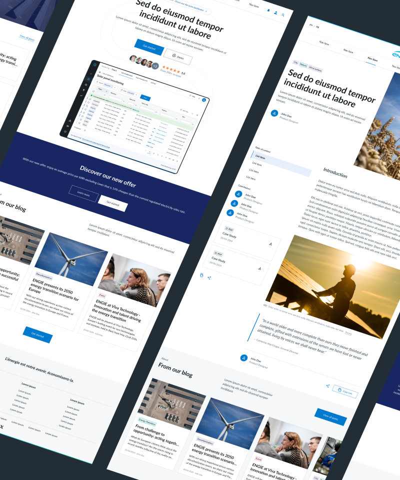
Here you'll find examples of pages build with Fluid's components. We are working on new versions of templates.

ENGIE Design System

Fluid Templates open_in_new

Pre-designed templates for common web pages like homepages, blog pages, and dashboards.

BETA
ENGIE Design System

Fluid Sections open_in_new

Modular building blocks like Hero and CTA banners for efficient page creation.

BETA