Imagery
Images can make a website more visually appealing and can help to break up large blocks of text, making the website more inviting and easier to read. Images can also be used to help create a brand identity and to communicate the values of the ENGIE brand to users.
Overview
Principles
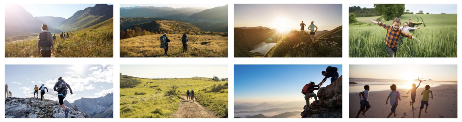
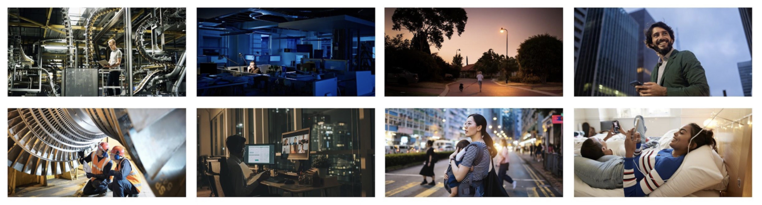
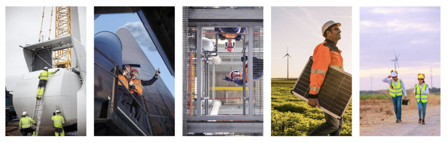
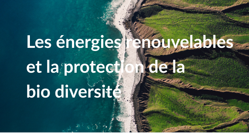
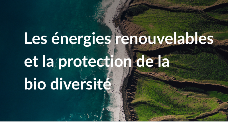
Preference is given to bright and realistic visuals with images representing ENGIE’s businesses and actions of its collaborators, by being authentic (in the choice of visuals, not idealistic, closer to the group), it is necessary to avoid close-ups and scripted representations, no “top shot” shots. The iconographic universe of the brand revolves mainly around three themes:
Collective
With our collaborators and users caught on the spot in their daily activities; promote naturalness, avoid posed or artificial attitudes.
Movement
Representing the energy of the group and by making the movement felt in the objects represented.
Concentration
On the professions at the heart of ENGIE and around of the Group’s commitment to accelerating of the energy transition, assuming the industrial aspect and showing its infrastructures.
Usage
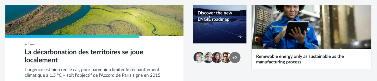
Imagery in digital usage can be used in various components : most of the time used in: Card, Carousel, Hero section or Avatar.
Access
You can download ENGIE pictures on ENGIE Mediacenter.
ENGIE Mediacenter (ENGIE restricted)
Common mistakes


Few rules to keep in mind
- Use descriptive, meaningful alternative text for images.
- Use empty alternative text for decorative images.
- Use the longdesc attribute for detailed descriptions of complex images.
- Use meaningful image file names.
- Avoid using text in images, as it may not be accessible to some users.